
Recent Analysis below. This one for a Botanic Garden. New Sample weekly.


SmarterSite Analysis is FREE
Our Ideas Are Yours To Use
Why settle for "Mostly Effective?"


Sample-Pages, with Team suggestions for enhancements, are outlined below:


Home Page
1. Please refer to our Rewrite link for top half of Home Page. Original seems too long. Weak syntax in several phrases.
2. Divide the 2 long paragraphs which end the Home Page into 4 shorter ones? This also needs addtional line-spacing.
3. Consider adding another graphic to the top-left quadrant for some quick visual-impact.
4. Line 7 of Paragraph 2 reads better as "We believe the indigenous plants of Northern California to be an essential part of the entire eco-system." Shorter, cleaner, and more to-the-point. Also shortens the whole paragraph by 3 lines.
5. Place link to plant prices after Paragraph 1. Team wanted to check costs without scrolling.
6. Consider a larger font after the first paragraph-break, drawing the reader's eye to your critical content there.
7. Reduce left-column links to 6-8. Avoid repetitive-confusion. Highlight 2-3 special links, instead of all in bold text?
Tours
1. Too much emphasis on a very complex package of tours. Perhaps Simplify and divide a.m. and p.m. for more Clicks?
2. We suggest a map-link for local reference. Also unclear to our Readers about weekend hours? Should be clarified.
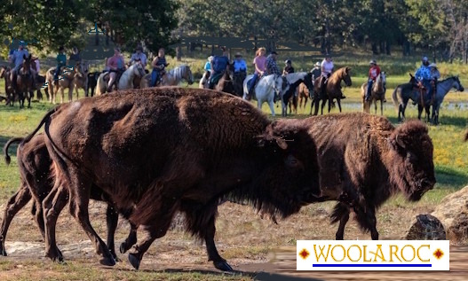
3. Teams rated the graphics on this page as 6 out of 10. There are many greens, but more plants and flowers with bright colors might relieve some of the current pictorial-monotony?
4. Change the top graphic to one showing more plants, less lawn and sky? Page will benefit from more Viewer-appeal.
5. Limit Page to 3-4 short Paragraphs; a sampling of what visitors learn from a Personal Tour. Add "Schedule Here!"
Education
1. Grammar Paragraph 4 Line 7. Use "those" not "them". This sentence reads easier using / ; / after word "planters".
2. Adding more pictures near the page-bottom will hold Viewers longer, and the text block above it will remain visible.
4. Descriptions of many plants use terminology unfamiliar to most of our Readers. Write for viewers new to botany, who just like plants and trees. Maybe links to definitions for some of the more important words?
5. Total Team-agreement that this Page would benefit from fewer, larger, plant-photos. We suggest adding one large, colorful picture showing multiple species right at the top. Duplicating the Home-Page photo seems far less effective.
The orginal of this Sample was 3 pages long. Pg 1 shown here; an example of what our Teams provide. Thanks! Michael and Daisy
For SmarterSite.org Viewers: